


Designer’s Liinks
Click to open links
Ui + Interaction
Mobile previews, minus the friction
Previewing through browsers or forced sign-ins breaks the mobile experience. This case study explores a faster, device-native way to review Figma prototypes.

The friction, up close

The friction,
up close

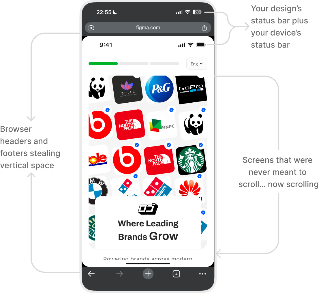
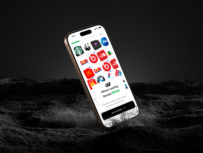
Picture this: you design a mobile screen and share it to another phone, a client, or a colleague for review.
It opens in a browser. Extra UI shows up. Scale breaks. Sometimes they (Client/Colleague) hit a wall asking for an account.
The design is fine.
The preview isn’t.

The friction, up close
User groups
Who this affects
The friction, up close
External tester

Starting point
No Figma app. No account.
Pain
Taps the link → lands in a browser.
The prototype looks compressed, scrolls awkwardly, and doesn’t reflect the real experience.

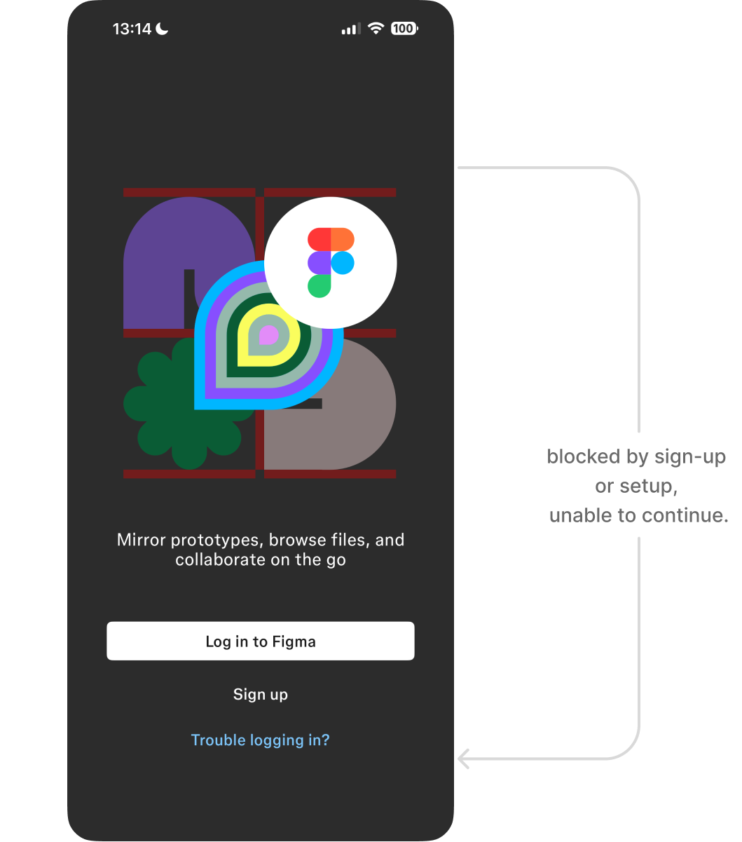
Executive stakeholder (CEO, Product Lead)
Starting point
Has the Figma Mirror app. No account. No time.
Pain
Wants to quickly walk through a flow.
Gets blocked by sign-up or setup, so reviews depend on live presentations instead of self-serve previews.

Fellow designer
Starting point
Has the app. Has an account. Logged in.
Pain
Not invited to the file but wants to test interactions or flows.
Previewing still depends on access rules, even for quick, exploratory reviews.

The friction, up close
Value
before setup
Good UX shows the value first, then asks for commitment.
This proposal lets anyone preview mobile interactions instantly, without browser UI, accounts, explanations, or detours.
The friction, up close

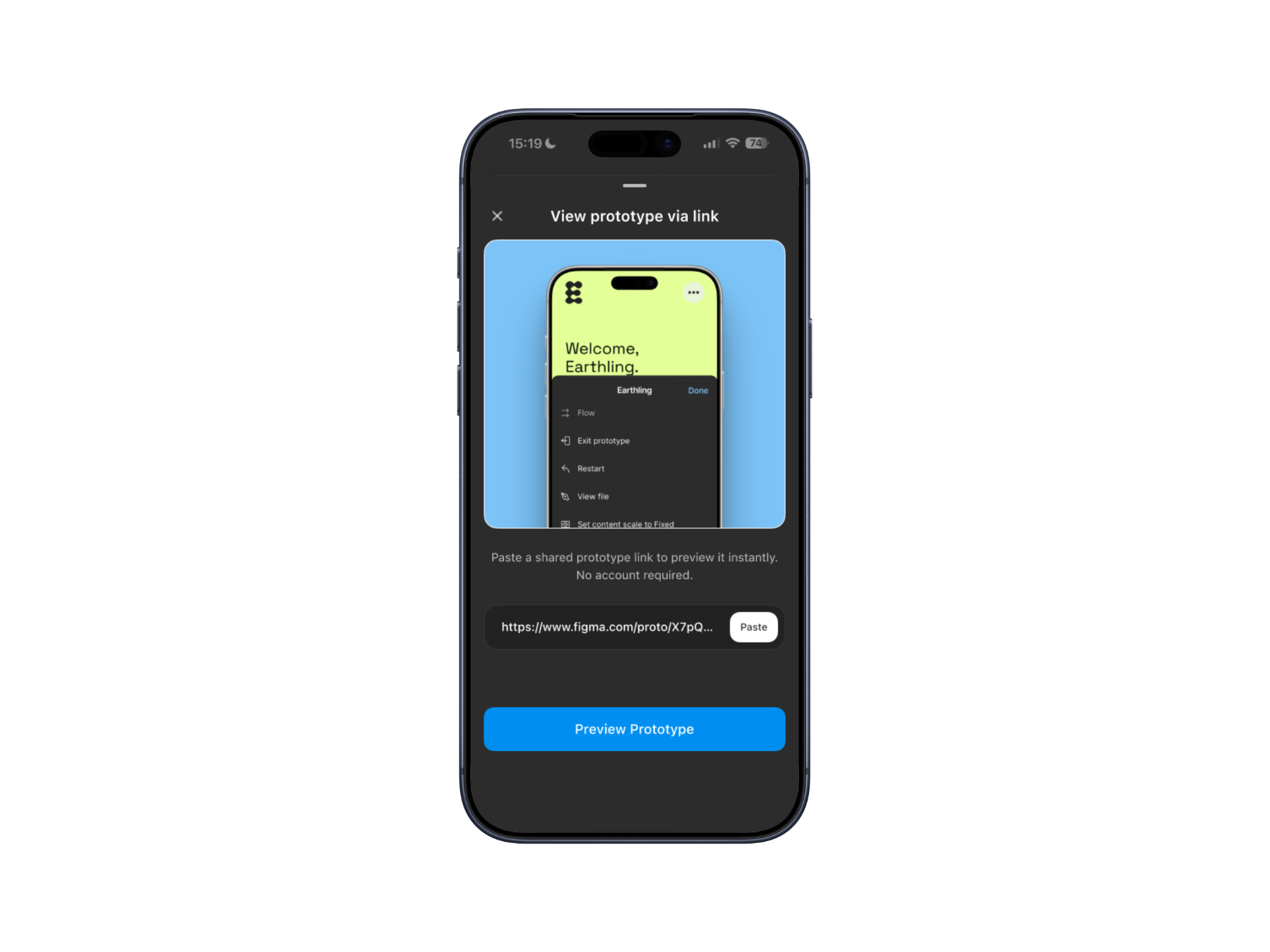
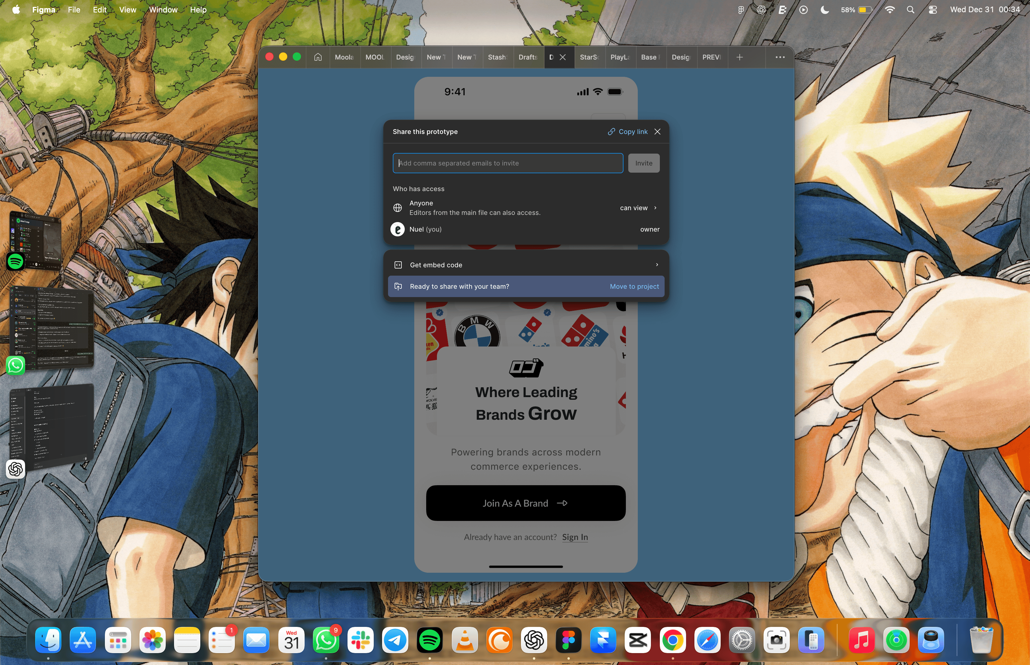
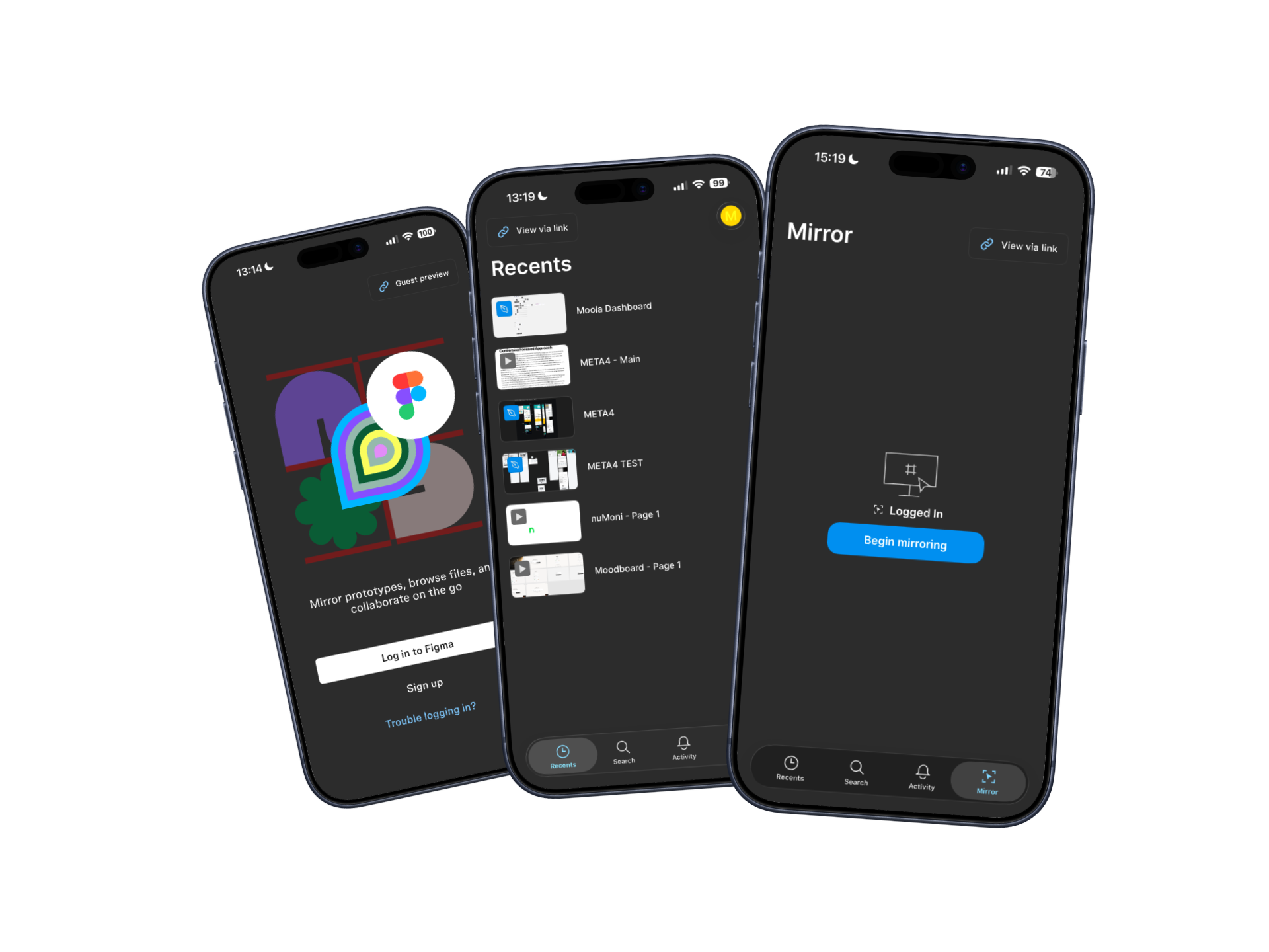
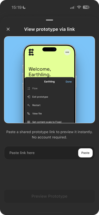
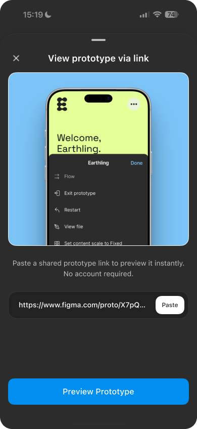
View via link
What previewing a shared prototype could feel like. (Sound added)
A link that opens directly in Figma Mirror and presents the prototype exactly as intended, full-screen, on mobile.

No browser chrome (Well Unless you are previewing From FigmaSite).
No compressed layouts.
No setup rituals.

Just the design, as designed.
The friction, up close
A simple, predictable flow
Once the value is clear, the flow should be obvious. This is a straightforward, repeatable interaction designed to fade into the background over time.
The friction, up close
1
Designer shares a prototype link
The designer copies a prototype link and sends it through any channel.

2
Recipient opens Figma Mirror
The recipient copies the link and opens Figma Mirror app on their device.
3
Choose preview mode
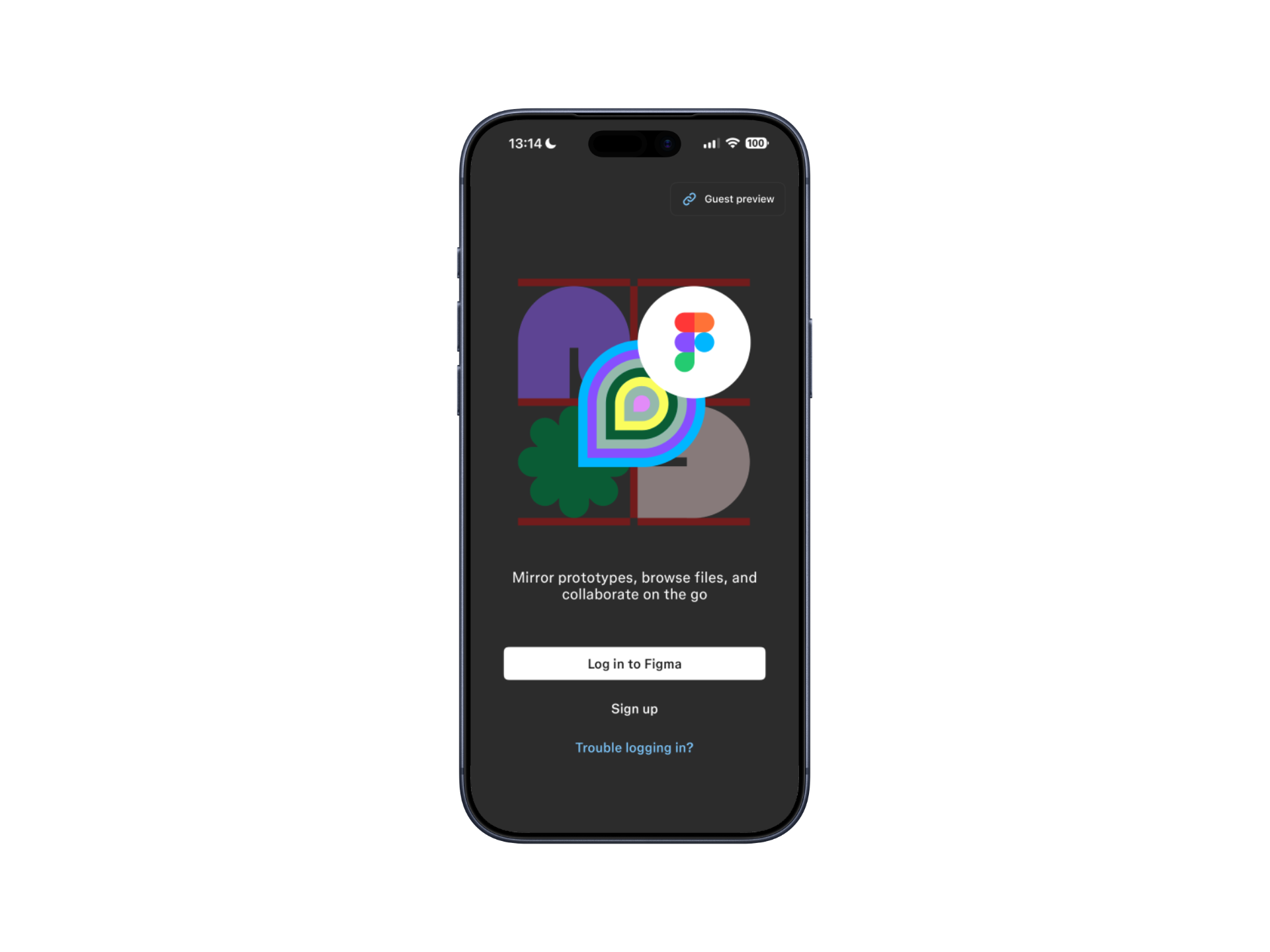
- Guest preview from the login screen
- View via link if already signed in

4
Paste link and preview
The recipient pastes the link, taps Preview prototype, and the prototype opens instantly.

This flow becomes clearer with repeated use, especially for teams and stakeholders who review prototypes frequently.
The friction, up close
UI states
and edge cases
This feature is designed to feel simple on the surface, with thoughtful handling underneath. These UI states and edge cases ensure the experience remains clear, predictable, and safe.
The friction, up close
Core UI states
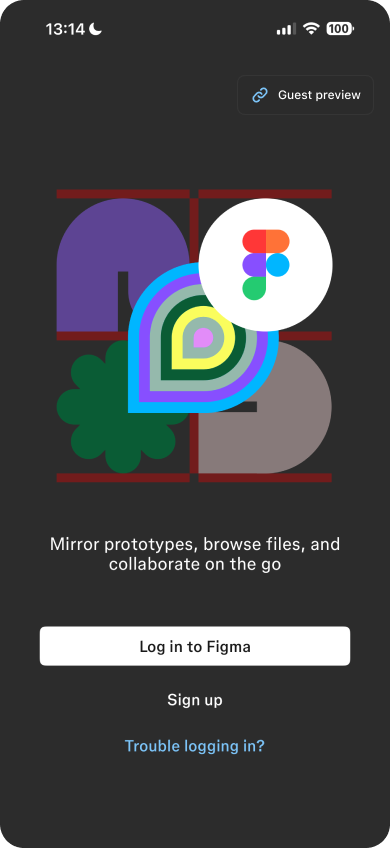
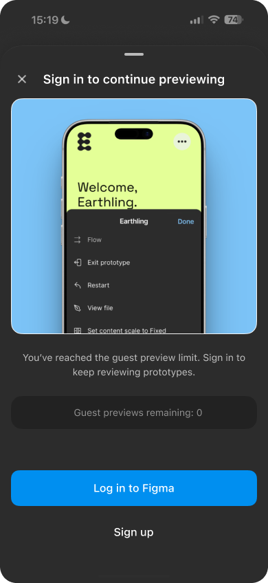
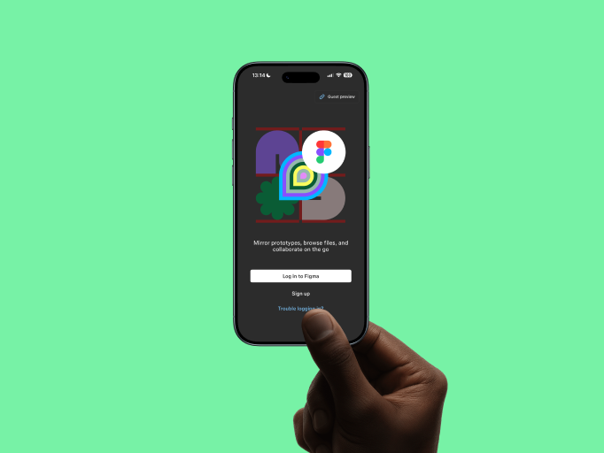
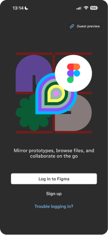
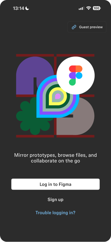
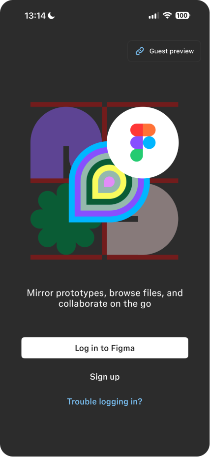
Before login (Guest preview)
For first-time or external viewers:
- Clear entry point from the login screen
- Paste or type a shared prototype link
- Limited usage before prompting sign-in (to preserve value-first access)
This prioritizes previewing over onboarding.


The friction, up close
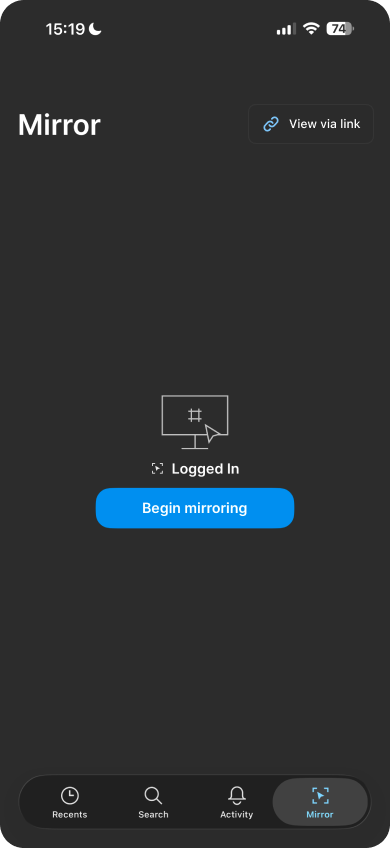
Core UI states
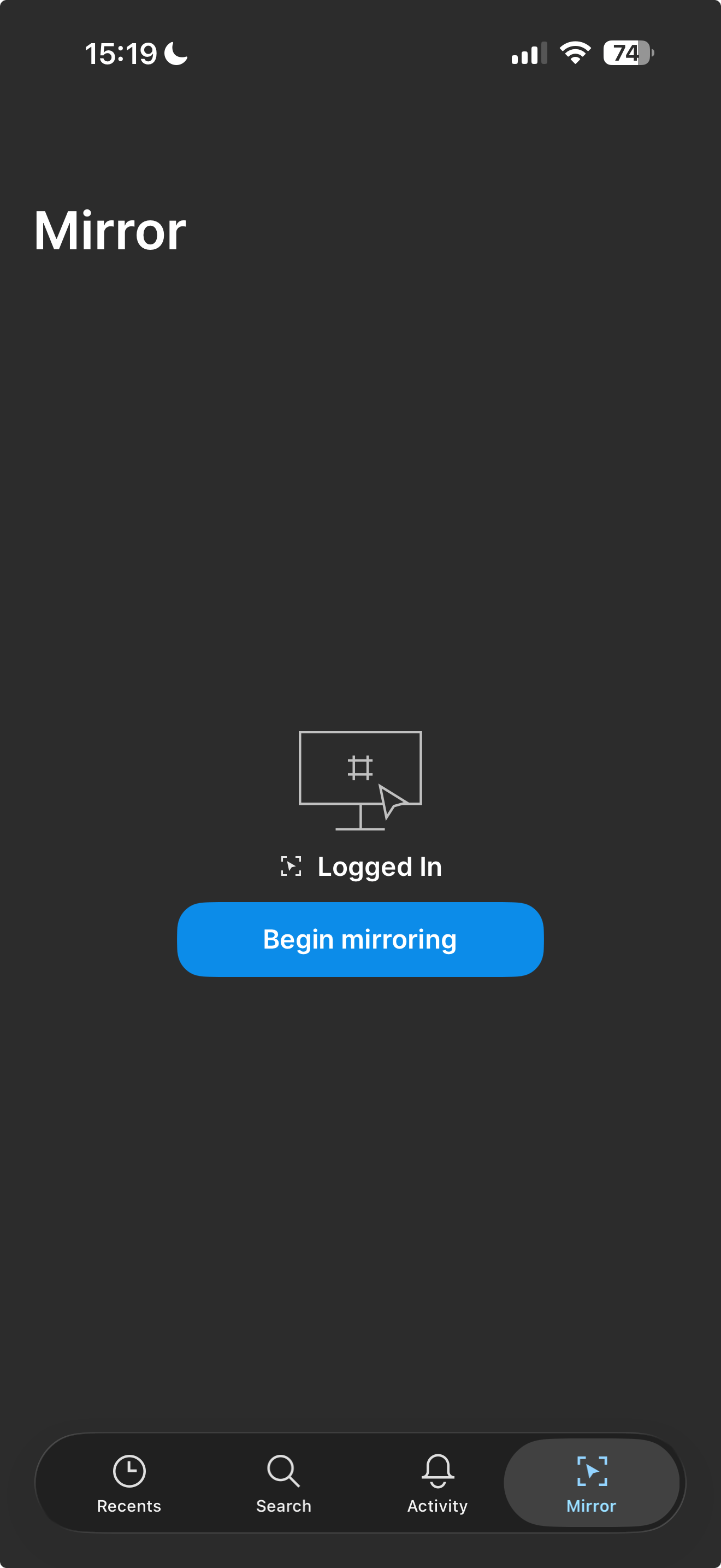
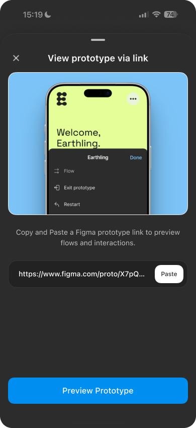
After login (View via link)
For logged-in users:
- Dedicated View via link action
- Identity is respected and visible to file owners
- Full-screen, native preview without browser interference
Same outcome. Fewer steps.
The friction, up close
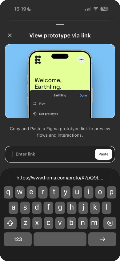
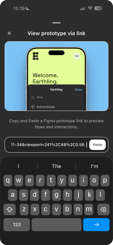
Considered edge cases
Flexible input
- Users can paste a link using the Paste action
- Or manually type the link into the input field
- The most recently copied link is surfaced for quick access
This reduces friction across different devices and habits.
The friction, up close
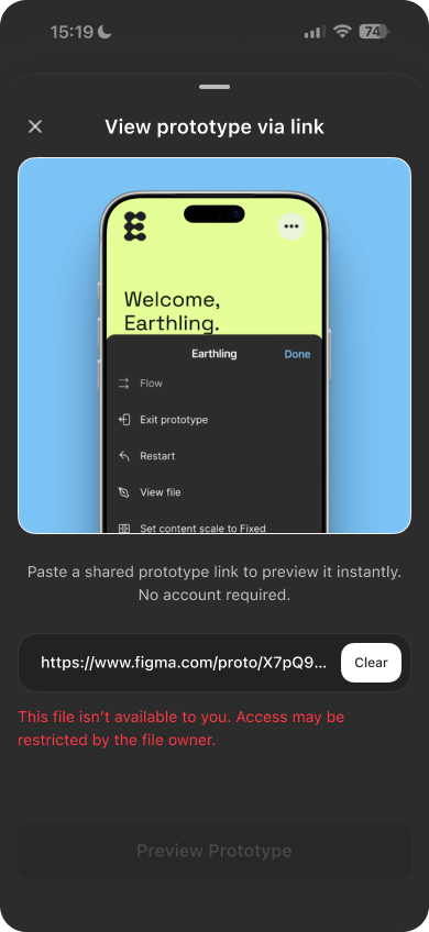
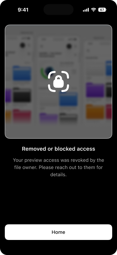
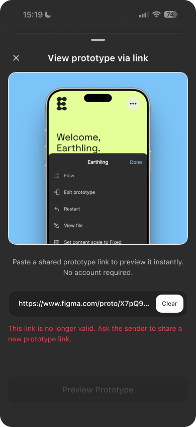
Considered edge cases
Clear error states are shown when:
- The file is private or restricted
- The user has been removed or blocked
- The link is invalid or expired
Each state explains what happened and what to do next, without dead ends.
The friction, up close
Why this matters
These details prevent confusion, protect access control, and keep the preview experience trustworthy, especially in shared or external review scenarios.
Small decisions. Big difference.
The friction, up close
Impact
This is a small addition with a meaningful effect.
- For teams, it removes friction from reviews, presentations, and quick checks across devices.
- For stakeholders, it turns prototype links into something they can open and understand instantly.
- For Figma, it lowers the barrier to trying Mirror, increasing real usage through everyday workflows.
No new habits required.
Just fewer interruptions between design and feedback.
The friction, up close
Why it belongs in Figma Mirror
Figma Mirror already exists to preview work on real devices.
This completes that promise by making previews accessible before accounts, setup, or explanations get in the way.
It’s not a new surface.
It’s a clearer entry point.
The friction, up close
The friction, up close
Final note
Mobile designers spend time perfecting the details.
The way those designs are previewed should respect that effort.
Thanks for reading.
Designer’s Liinks
Click to open links
Preview the concept
Click to open links
If the Figma app is installed and you’re signed in, the prototype opens there. Otherwise, it opens in the browser.
Mirror
Visit figma
Designer’s Liinks
Click to open links
Ui + Interaction
Mobile previews, minus the friction
Previewing through browsers or forced sign-ins breaks the mobile experience. This case study explores a faster, device-native way to review Figma prototypes.

The friction, up close
The friction,
up close
Picture this: you design a mobile screen and share it to another phone, a client, or a colleague for review.
It opens in a browser. Extra UI shows up. Scale breaks. Sometimes they (Client/Colleague) hit a wall asking for an account.
The design is fine.
The preview isn’t.

The friction, up close
User groups
Who this affects
The friction, up close
External tester

Starting point
No Figma app. No account.
Pain
Taps the link → lands in a browser.
The prototype looks compressed, scrolls awkwardly, and doesn’t reflect the real experience.

Executive stakeholder (CEO, Product Lead)
Starting point
Has the Figma Mirror app. No account. No time.
Pain
Wants to quickly walk through a flow.
Gets blocked by sign-up or setup, so reviews depend on live presentations instead of self-serve previews.

Fellow designer
Starting point
Has the app. Has an account. Logged in.
Pain
Not invited to the file but wants to test interactions or flows.
Previewing still depends on access rules, even for quick, exploratory reviews.

The friction, up close
Value
before setup
Good UX shows the value first, then asks for commitment.
This proposal lets anyone preview mobile interactions instantly, without browser UI, accounts, explanations, or detours.
The friction, up close
View via link
What previewing a shared prototype could feel like. (Sound added)
A link that opens directly in Figma Mirror and presents the prototype exactly as intended, full-screen, on mobile.
No browser chrome (Well Unless you are previewing From FigmaSite).
No compressed layouts.
No setup rituals.
Just the design, as designed.
The friction, up close
A simple, predictable flow
Once the value is clear, the flow should be obvious. This is a straightforward, repeatable interaction designed to fade into the background over time.
The friction, up close
1
Designer shares a prototype link
The designer copies a prototype link and sends it through any channel.

2
Recipient opens Figma Mirror
The recipient copies the link and opens Figma Mirror app on their device.

3
Choose preview mode
- Guest preview from the login screen
- View via link if already signed in

4
Paste link and preview
The recipient pastes the link, taps Preview prototype, and the prototype opens instantly.

This flow becomes clearer with repeated use, especially for teams and stakeholders who review prototypes frequently.
The friction, up close
UI states and edge cases
This feature is designed to feel simple on the surface, with thoughtful handling underneath. These UI states and edge cases ensure the experience remains clear, predictable, and safe.
The friction, up close
Core UI states
Before login (Guest preview)
For first-time or external viewers:
- Clear entry point from the login screen
- Paste or type a shared prototype link
- Limited usage before prompting sign-in (to preserve value-first access)
This prioritizes previewing over onboarding.
The friction, up close
Core UI states
After login (View via link)
For logged-in users:
- Dedicated View via link action
- Identity is respected and visible to file owners
- Full-screen, native preview without browser interference
Same outcome. Fewer steps.
The friction, up close
Considered edge cases
Flexible input
- Users can paste a link using the Paste action
- Or manually type the link into the input field
- The most recently copied link is surfaced for quick access
This reduces friction across different devices and habits.
The friction, up close
Considered edge cases
Clear error states are shown when:
- The file is private or restricted
- The user has been removed or blocked
- The link is invalid or expired
Each state explains what happened and what to do next, without dead ends.
The friction, up close
Why this matters
These details prevent confusion, protect access control, and keep the preview experience trustworthy, especially in shared or external review scenarios.
Small decisions. Big difference.
The friction, up close
Impact
This is a small addition with a meaningful effect.
- For teams, it removes friction from reviews, presentations, and quick checks across devices.
- For stakeholders, it turns prototype links into something they can open and understand instantly.
- For Figma, it lowers the barrier to trying Mirror, increasing real usage through everyday workflows.

No new habits required.
Just fewer interruptions between design and feedback.
The friction, up close
Why it belongs in Figma Mirror
Figma Mirror already exists to preview work on real devices.
This completes that promise by making previews accessible before accounts, setup, or explanations get in the way.
It’s not a new surface.
It’s a clearer entry point.
The friction, up close


The friction, up close
Final note
Mobile designers spend time perfecting the details.
The way those designs are previewed should respect that effort.
Thanks for reading.
Designer’s Liinks
Click to open links
Preview the concept
Click to open links
If the Figma app is installed and you’re signed in, the prototype opens there. Otherwise, it opens in the browser.
Mirror
Visit figma
Designer’s Liinks
Click to open links
Ui + Interaction
Mobile previews,
minus the friction
Previewing through browsers or forced sign-ins breaks the mobile experience. This case study explores a faster, device-native way to review Figma prototypes.

The friction, up close
The friction, up close
Picture this: you design a mobile screen and share it to another phone, a client, or a colleague for review.
It opens in a browser. Extra UI shows up. Scale breaks. Sometimes they (Client/Colleague) hit a wall asking for an account.
The design is fine.
The preview isn’t.

The friction, up close
User groups
Who this affects
The friction, up close
External tester

Starting point
No Figma app. No account.
Pain
Taps the link → lands in a browser.
The prototype looks compressed, scrolls awkwardly, and doesn’t reflect the real experience.

Executive stakeholder (CEO, Product Lead)
Starting point
Has the Figma Mirror app. No account. No time.
Pain
Wants to quickly walk through a flow.
Gets blocked by sign-up or setup, so reviews depend on live presentations instead of self-serve previews.

Fellow designer
Starting point
Has the app. Has an account. Logged in.
Pain
Not invited to the file but wants to test interactions or flows.
Previewing still depends on access rules, even for quick, exploratory reviews.

The friction, up close
Value before setup
Good UX shows the value first, then asks for commitment.
This proposal lets anyone preview mobile interactions instantly, without browser UI, accounts, explanations, or detours.
The friction, up close
View via link
What previewing a shared prototype could feel like. (Sound added)
A link that opens directly in Figma Mirror and presents the prototype exactly as intended, full-screen, on mobile.
No browser chrome (Well Unless you are previewing From FigmaSite).
No compressed layouts.
No setup rituals.
Just the design, as designed.
The friction, up close
A simple, predictable flow
Once the value is clear, the flow should be obvious. This is a straightforward, repeatable interaction designed to fade into the background over time.
The friction, up close
1
Designer shares a prototype link
The designer copies a prototype link and sends it through any channel.

2
Recipient opens Figma Mirror
The recipient copies the link and opens Figma Mirror app on their device.

3
Choose preview mode
- Guest preview from the login screen
- View via link if already signed in

4
Paste link and preview
The recipient pastes the link, taps Preview prototype, and the prototype opens instantly.
This flow becomes clearer with repeated use, especially for teams and stakeholders who review prototypes frequently.
The friction, up close
UI states and edge cases
This feature is designed to feel simple on the surface, with thoughtful handling underneath. These UI states and edge cases ensure the experience remains clear, predictable, and safe.
The friction, up close
Core UI states
Before login (Guest preview)
For first-time or external viewers:
- Clear entry point from the login screen
- Paste or type a shared prototype link
- Limited usage before prompting sign-in (to preserve value-first access)
This prioritizes previewing over onboarding.
The friction, up close
Core UI states
After login (View via link)
For logged-in users:
- Dedicated View via link action
- Identity is respected and visible to file owners
- Full-screen, native preview without browser interference
Same outcome. Fewer steps.
The friction, up close
Considered edge cases
Flexible input
- Users can paste a link using the Paste action
- Or manually type the link into the input field
- The most recently copied link is surfaced for quick access
This reduces friction across different devices and habits.
The friction, up close
Considered edge cases
Clear error states are shown when:
- The file is private or restricted
- The user has been removed or blocked
- The link is invalid or expired
Each state explains what happened and what to do next, without dead ends.
The friction, up close
Why this matters
These details prevent confusion, protect access control, and keep the preview experience trustworthy, especially in shared or external review scenarios.
Small decisions. Big difference.
The friction, up close
Impact
This is a small addition with a meaningful effect.
- For teams, it removes friction from reviews, presentations, and quick checks across devices.
- For stakeholders, it turns prototype links into something they can open and understand instantly.
- For Figma, it lowers the barrier to trying Mirror, increasing real usage through everyday workflows.

No new habits required.
Just fewer interruptions between design and feedback.
The friction, up close
Why it belongs in Figma Mirror
Figma Mirror already exists to preview work on real devices.
This completes that promise by making previews accessible before accounts, setup, or explanations get in the way.
It’s not a new surface.
It’s a clearer entry point.
The friction, up close


The friction, up close
Final note
Mobile designers spend time perfecting the details.
The way those designs are previewed should respect that effort.
Thanks for reading.
Designer’s Liinks
Click to open links
Preview the concept
Click to open links
If the Figma app is installed and you’re signed in, the prototype opens there. Otherwise, it opens in the browser.
Mirror
Visit figma
Designer’s Liinks
Click to open links
Ui + Interaction
Mobile previews, minus the friction
Previewing through browsers or forced sign-ins breaks the mobile experience. This case study explores a faster, device-native way to review Figma prototypes.

The friction, up close

The friction, up close
Picture this: you design a mobile screen and share it to another phone, a client, or a colleague for review.
It opens in a browser. Extra UI shows up. Scale breaks. Sometimes they (Client/Colleague) hit a wall asking for an account.
The design is fine.
The preview isn’t.

The friction, up close
User groups
Who this affects
The friction, up close
External tester

Starting point
No Figma app. No account.
Pain
Taps the link → lands in a browser.
The prototype looks compressed, scrolls awkwardly, and doesn’t reflect the real experience.


Executive stakeholder (CEO, Product Lead)

Starting point
Has the Figma Mirror app. No account. No time.
Pain
Wants to quickly walk through a flow.
Gets blocked by sign-up or setup, so reviews depend on live presentations instead of self-serve previews.

Fellow designer

Starting point
Has the app. Has an account. Logged in.
Pain
Not invited to the file but wants to test interactions or flows.
Previewing still depends on access rules, even for quick, exploratory reviews.

The friction, up close
Value before setup
Good UX shows the value first, then asks for commitment.
This proposal lets anyone preview mobile interactions instantly, without browser UI, accounts, explanations, or detours.
The friction, up close
View via link
What previewing a shared prototype could feel like. (Sound added)
A link that opens directly in Figma Mirror and presents the prototype exactly as intended, full-screen, on mobile.
No browser chrome (Well Unless you are previewing From FigmaSite).
No compressed layouts.
No setup rituals.
Just the design, as designed.
The friction, up close
A simple, predictable flow
Once the value is clear, the flow should be obvious. This is a straightforward, repeatable interaction designed to fade into the background over time.
The friction, up close
1
Designer shares a prototype link
The designer copies a prototype link and sends it through any channel.

2
Recipient opens Figma Mirror
The recipient copies the link and opens Figma Mirror app on their device.
3
Choose preview mode
- Guest preview from the login screen
- View via link if already signed in

4
Paste link and preview
The recipient pastes the link, taps Preview prototype, and the prototype opens instantly.
This flow becomes clearer with repeated use, especially for teams and stakeholders who review prototypes frequently.
The friction, up close
UI states and edge cases
This feature is designed to feel simple on the surface, with thoughtful handling underneath. These UI states and edge cases ensure the experience remains clear, predictable, and safe.
The friction, up close
Core UI states
Before login (Guest preview)
For first-time or external viewers:
- Clear entry point from the login screen
- Paste or type a shared prototype link
- Limited usage before prompting sign-in (to preserve value-first access)
This prioritizes previewing over onboarding.
The friction, up close
Core UI states
After login (View via link)
For logged-in users:
- Dedicated View via link action
- Identity is respected and visible to file owners
- Full-screen, native preview without browser interference
Same outcome. Fewer steps.
The friction, up close
Considered edge cases
Flexible input
- Users can paste a link using the Paste action
- Or manually type the link into the input field
- The most recently copied link is surfaced for quick access
This reduces friction across different devices and habits.
The friction, up close
Considered edge cases
Clear error states are shown when:
- The file is private or restricted
- The user has been removed or blocked
- The link is invalid or expired
Each state explains what happened and what to do next, without dead ends.
The friction, up close
Why this matters
These details prevent confusion, protect access control, and keep the preview experience trustworthy, especially in shared or external review scenarios.
Small decisions. Big difference.
The friction, up close
Impact
This is a small addition with a meaningful effect.
- For teams, it removes friction from reviews, presentations, and quick checks across devices.
- For stakeholders, it turns prototype links into something they can open and understand instantly.
- For Figma, it lowers the barrier to trying Mirror, increasing real usage through everyday workflows.

No new habits required.
Just fewer interruptions between design and feedback.
The friction, up close
Why it belongs in Figma Mirror
Figma Mirror already exists to preview work on real devices.
This completes that promise by making previews accessible before accounts, setup, or explanations get in the way.
It’s not a new surface.
It’s a clearer entry point.
The friction, up close

The friction, up close
Final note
Mobile designers spend time perfecting the details.
The way those designs are previewed should respect that effort.
Thanks for reading.
Designer’s Liinks
Click to open links
Preview the concept
Click to open links
If the Figma app is installed and you’re signed in, the prototype opens there. Otherwise, it opens in the browser.